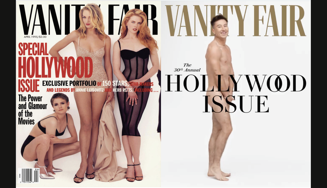
The 30th annual Vanity Fair Hollywood is pretty cheeky and it has a connection to the first one, which I designed in 1995.
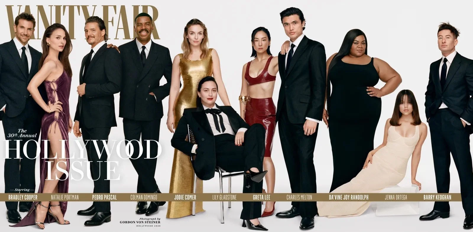
The latest stars (in order below) Bradley Cooper, Natalie Portman, Pedro Pascal, Colman Domingo, Jodie Comer, Lily Gladstone, Greta Lee, Charles Melton, Da’Vine Joy Randolph, Jenna Ortega, and Barry Keoghan.

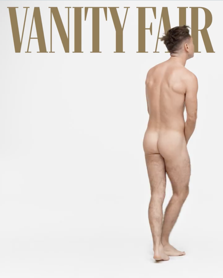
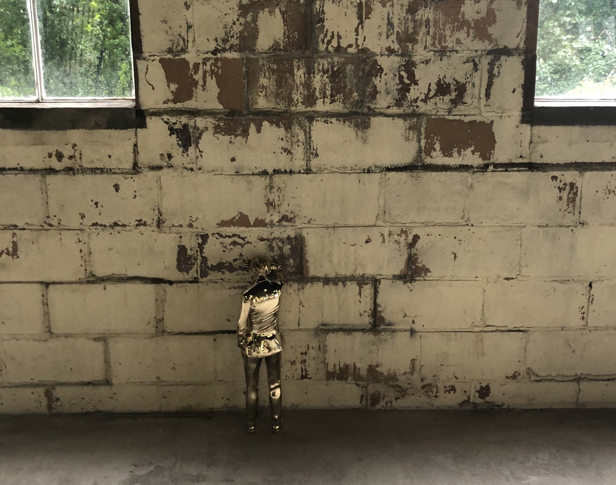
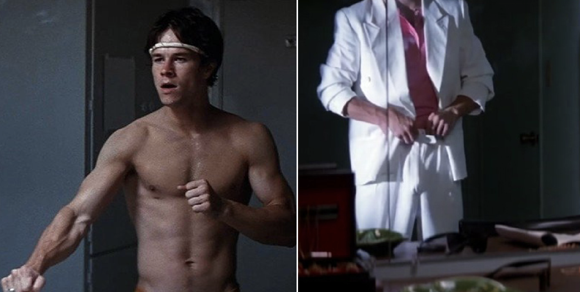
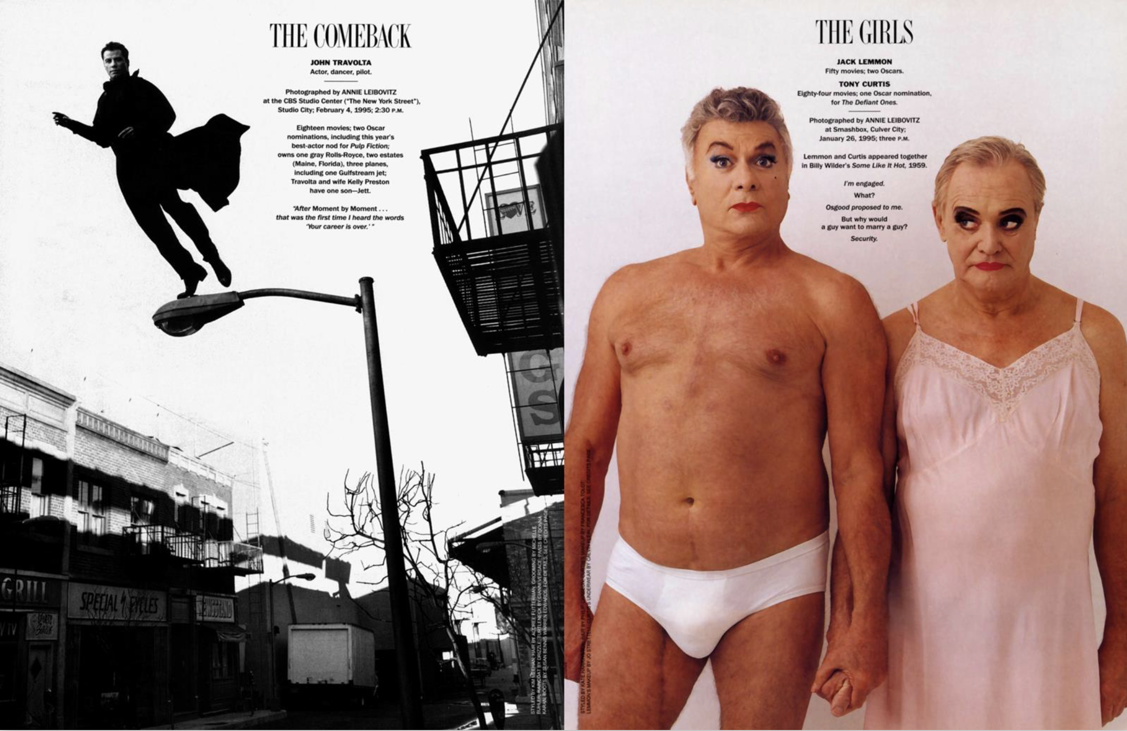
It’s sort of a full circle moment, in that when I designed the issue for Art Director David Harris, the magazine had it’s first ever Vanity Fair party in LA, I created a billboard for Sunset Blvd which featured lingerie clad starlets and ended with Jack Lemmon and Tony Curtis, in semi-drag in briefs and a slip. Barry Keoghan, infamous for his nude dance in Saltburn, has reprised his naked jig for a video shot for the magazine by Gordon Von Steiner. (Still above.)

All up-and-coming starlets at the time, the next year (which I also designed) featured all the young dudes, like Leo…
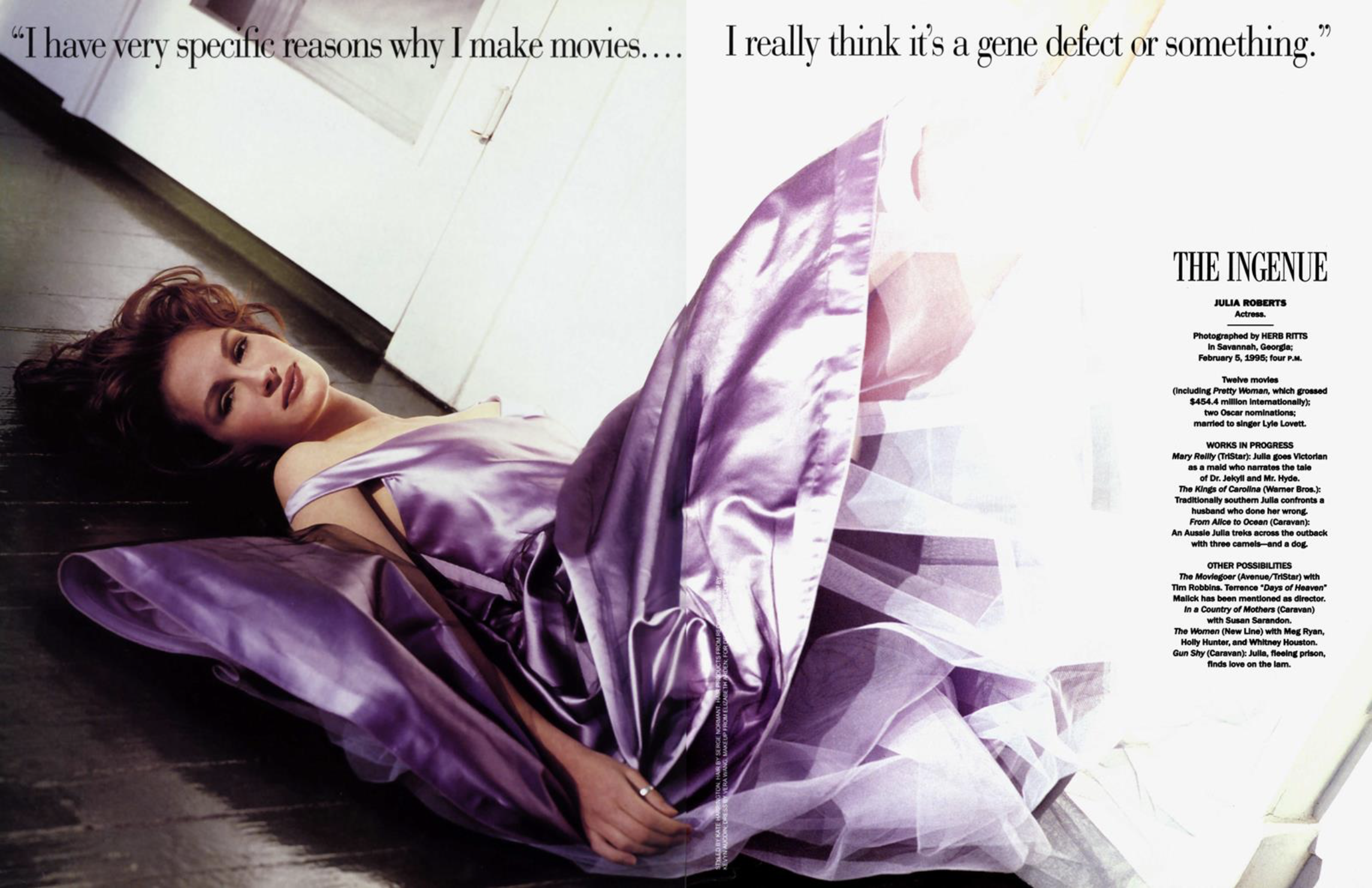
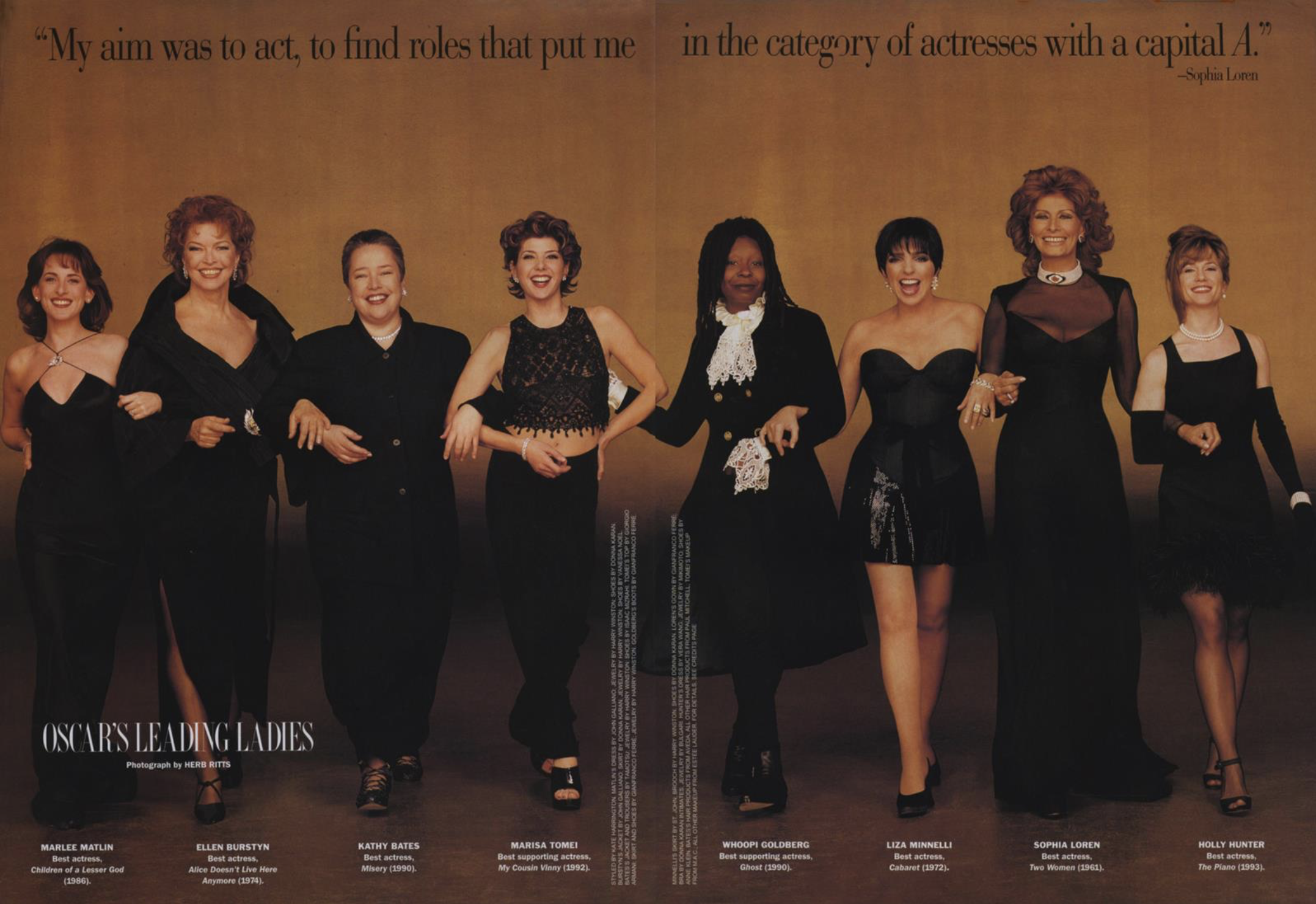
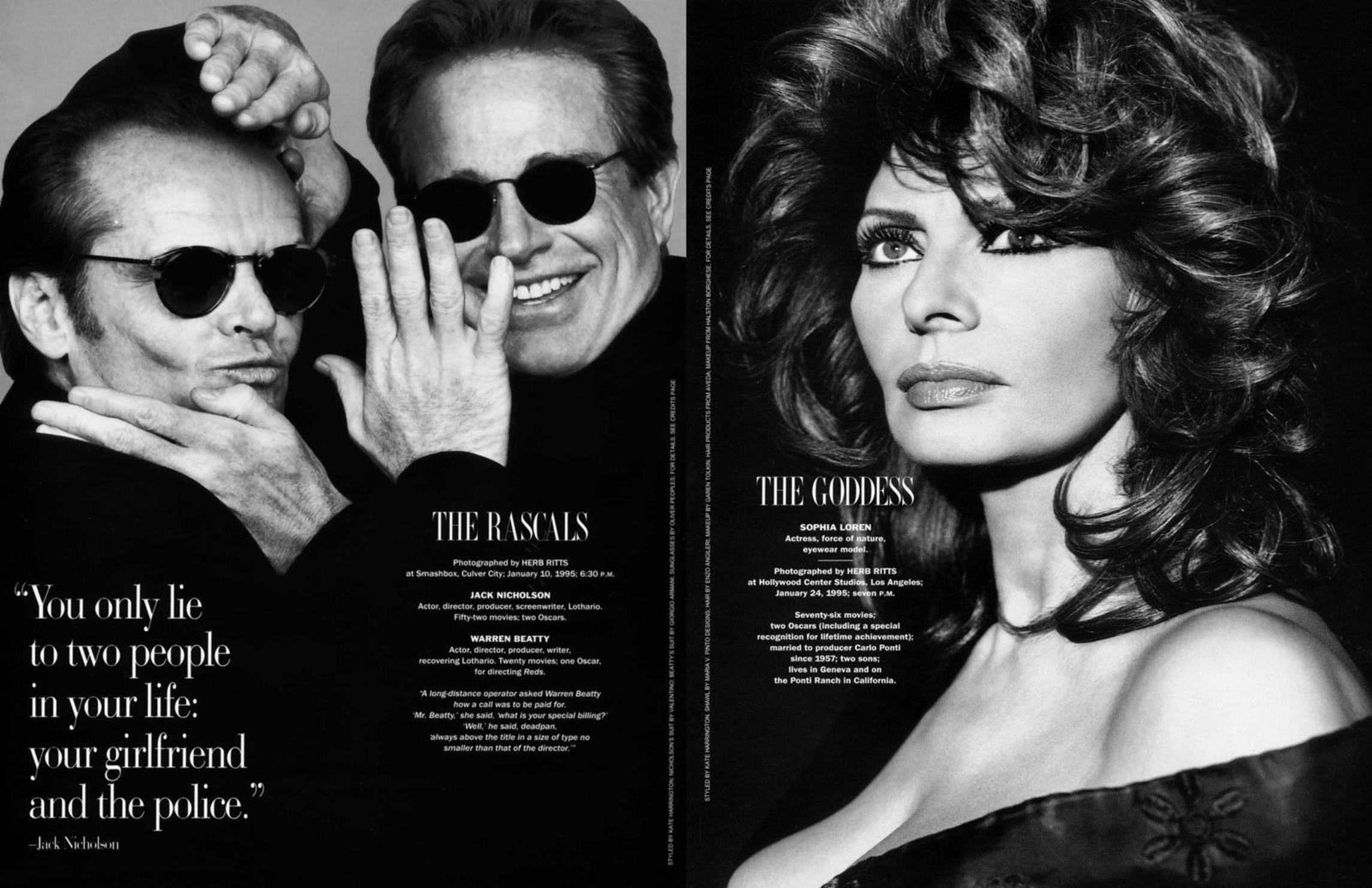
Will anyone else remember? 30 years ago was a long time. If I was looking back in ‘95 to 30 years prior, Sophia Loren and The Beatles would have been big. Fittingly, Loren is in that first Hollywood Issue (below).
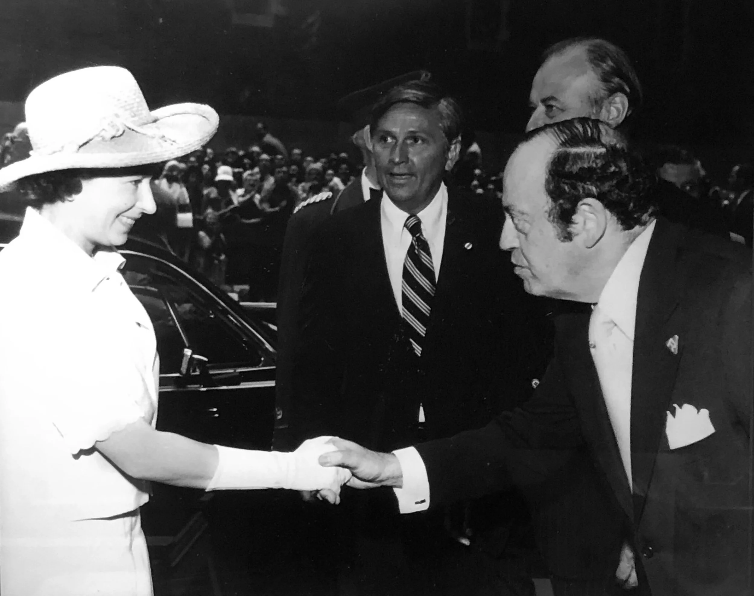
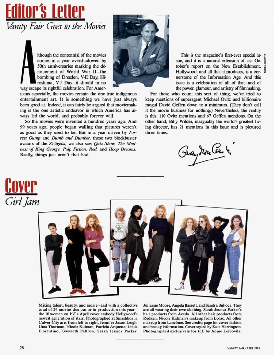
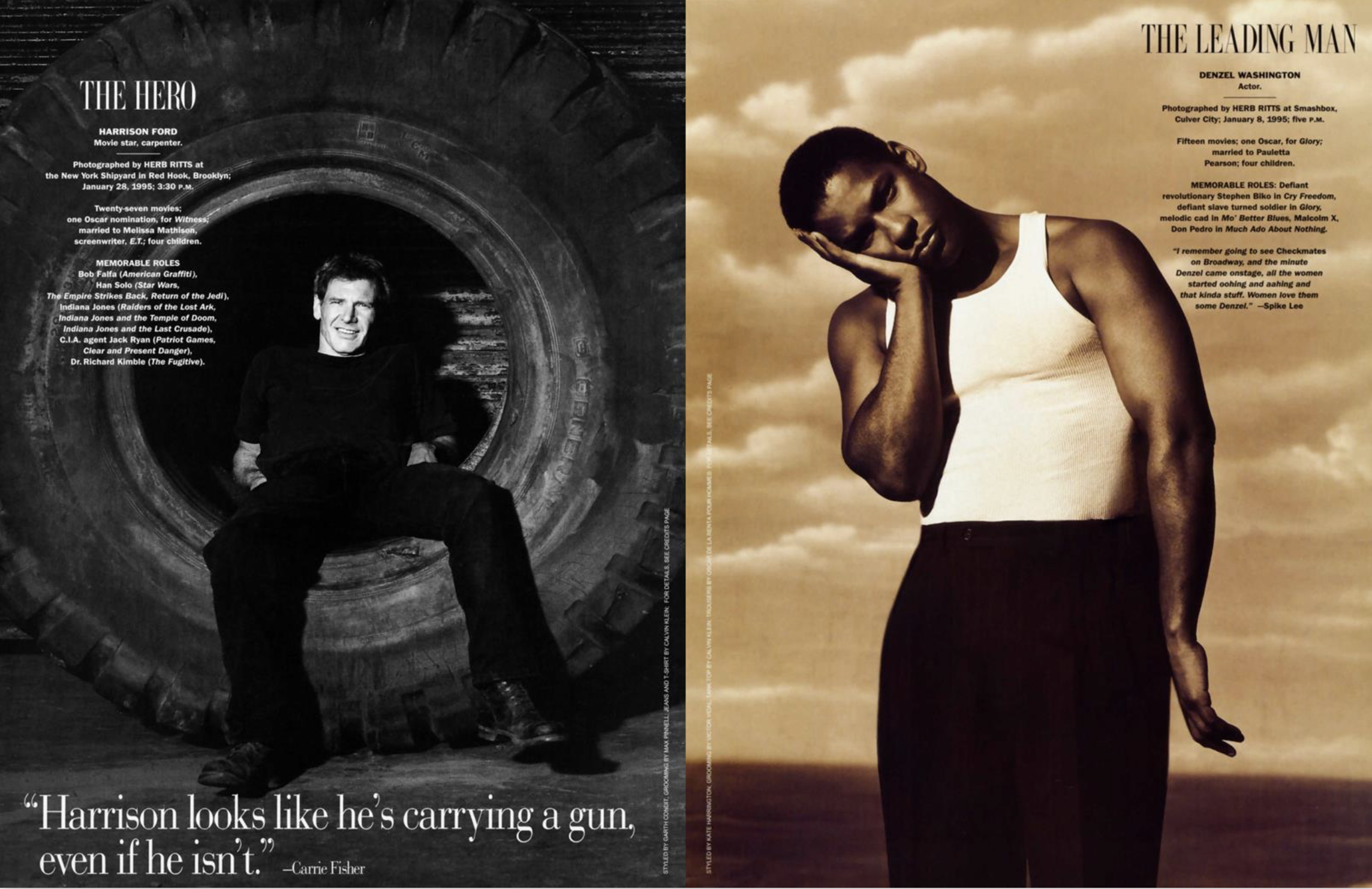
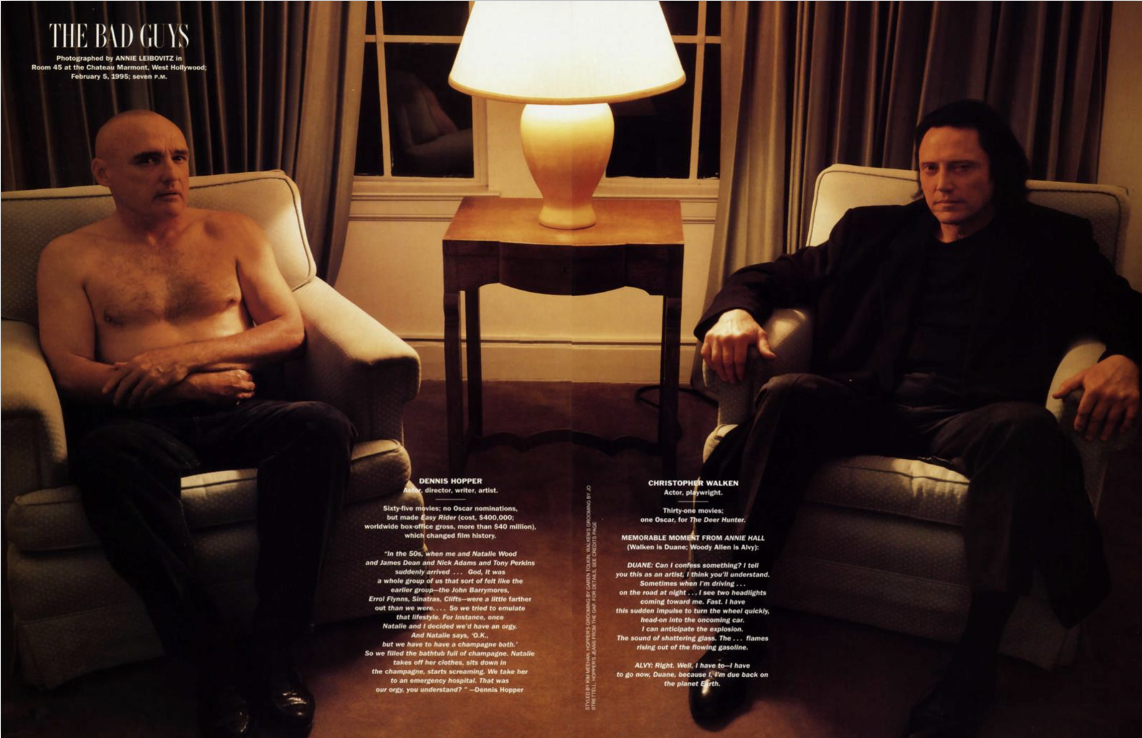
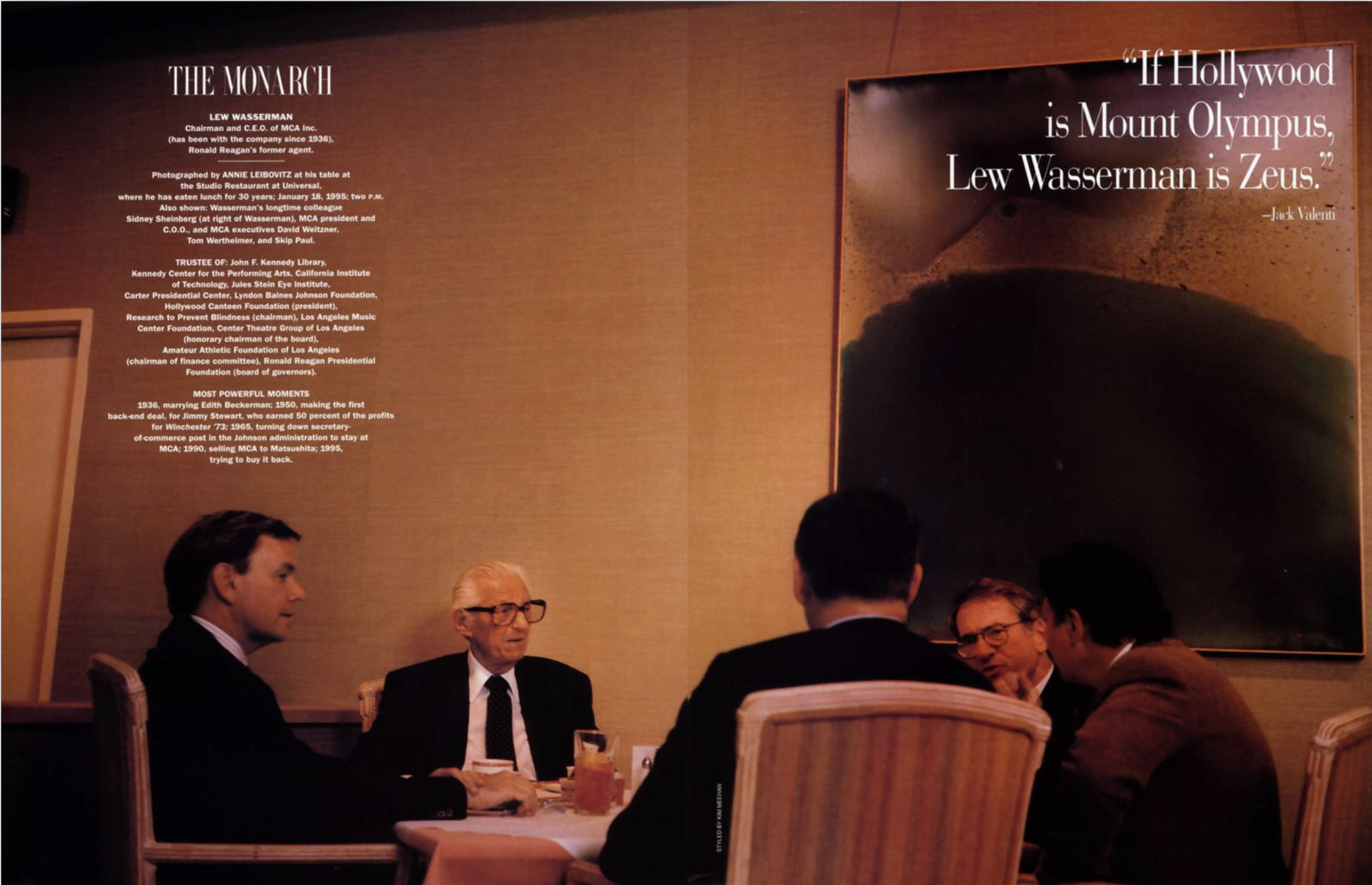
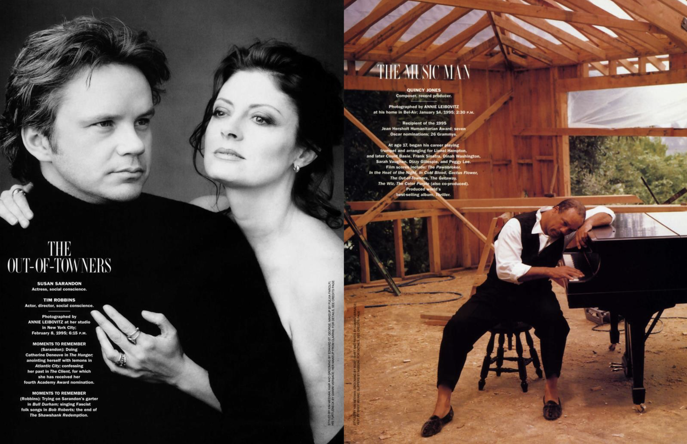
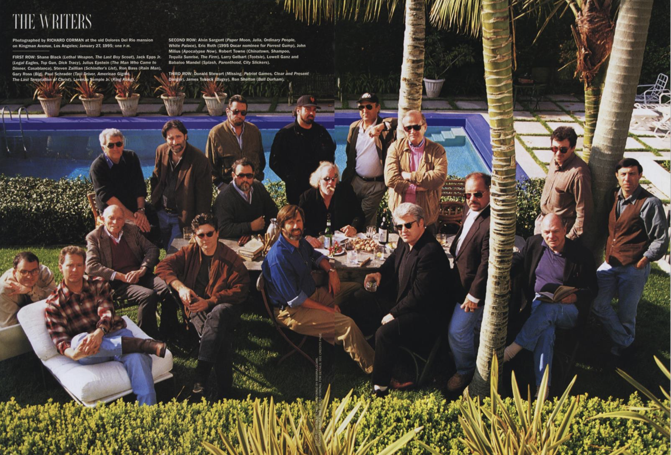
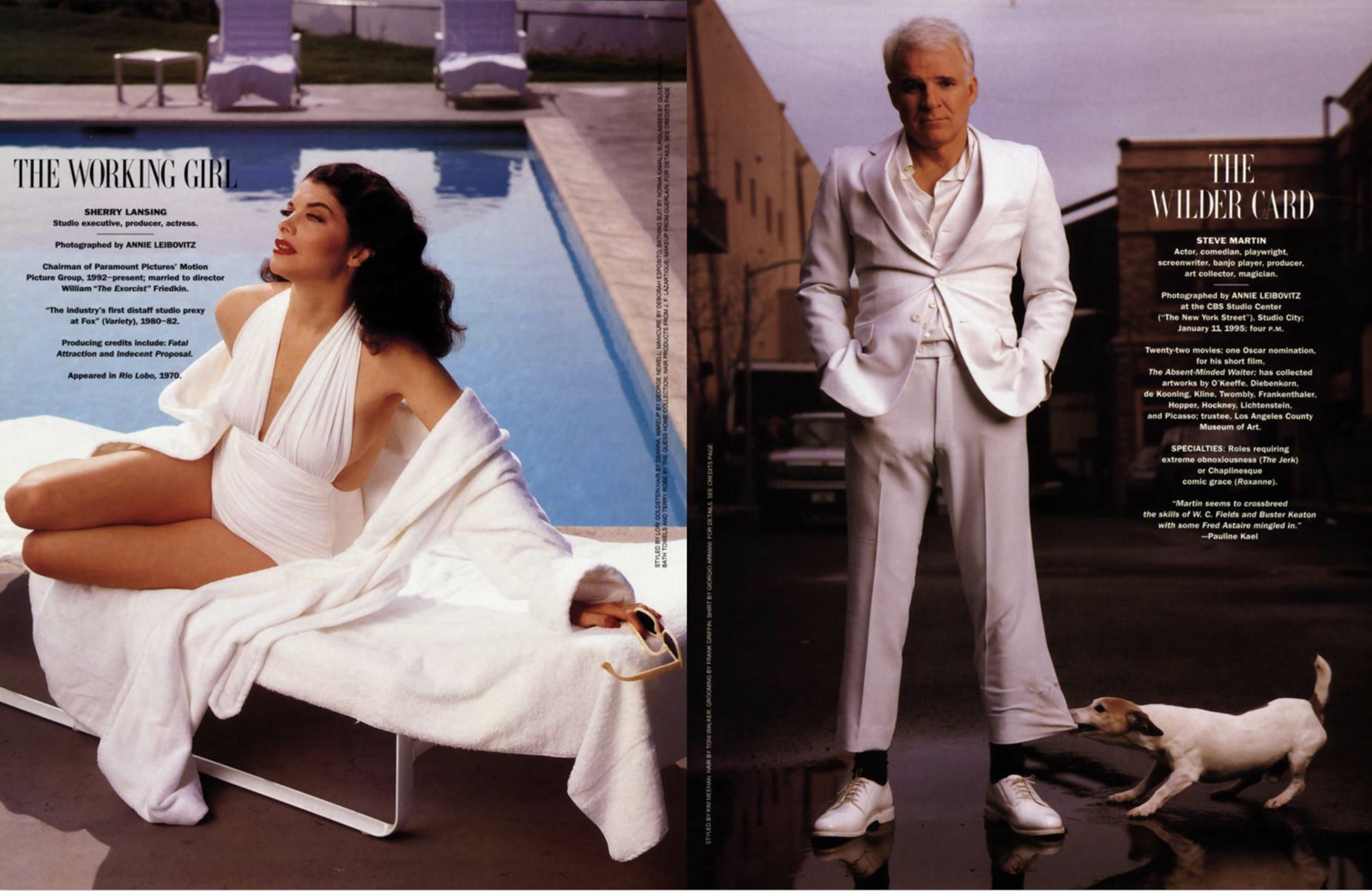
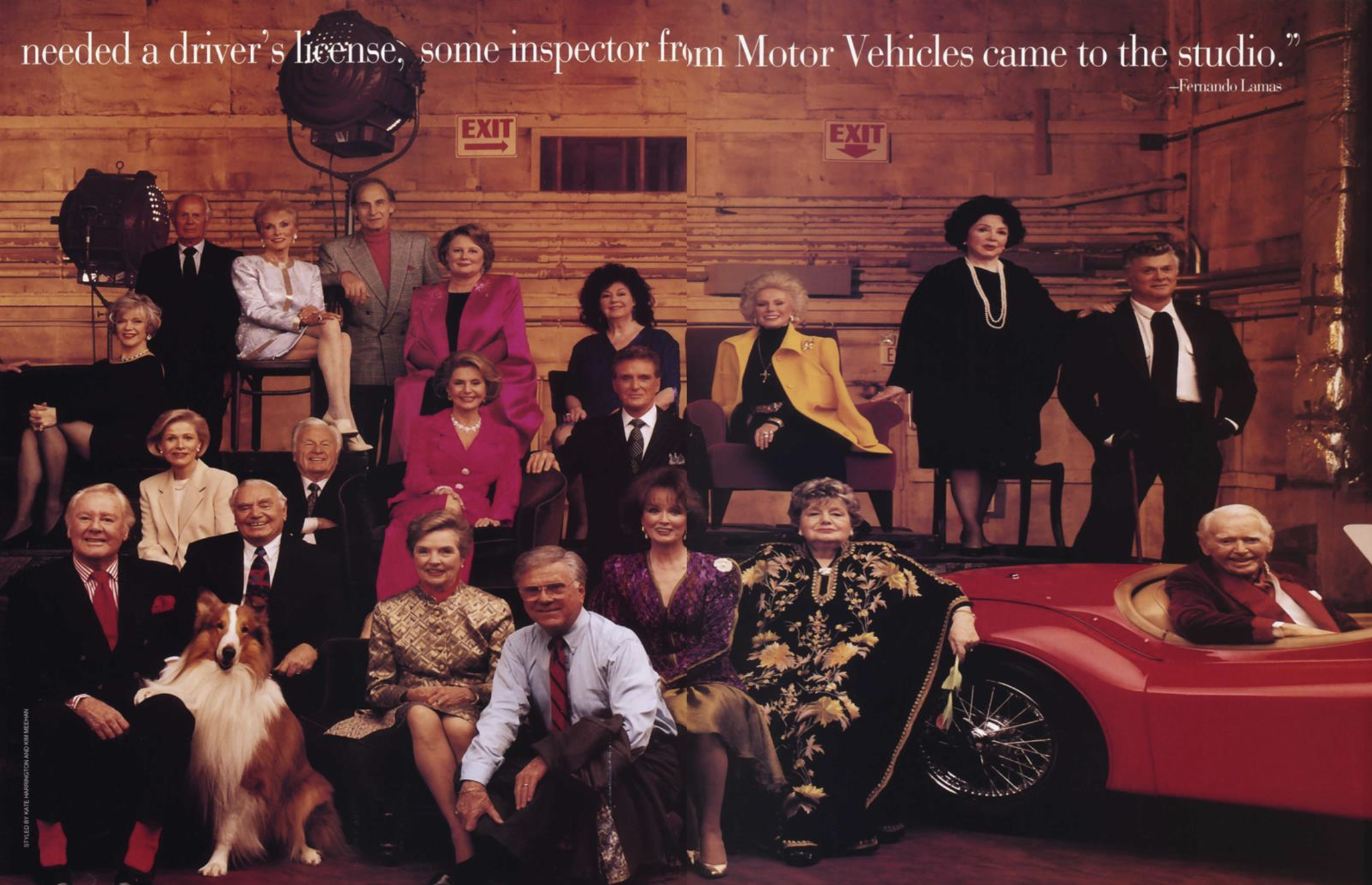
I first worked for Vanity Fair under Leo Lerman and Tina Brown in the mid 80s. In the early 90s, I was a freelance art director and the magazine’s then art director, David Harris, asked me to come in and work on a special portfolio they called, “A Hollywood Portfolio. The Hollywood Issue was obviously not a thing yet, just another gig for me, but it was fun to be back at VF as many of my co-workers were still there.
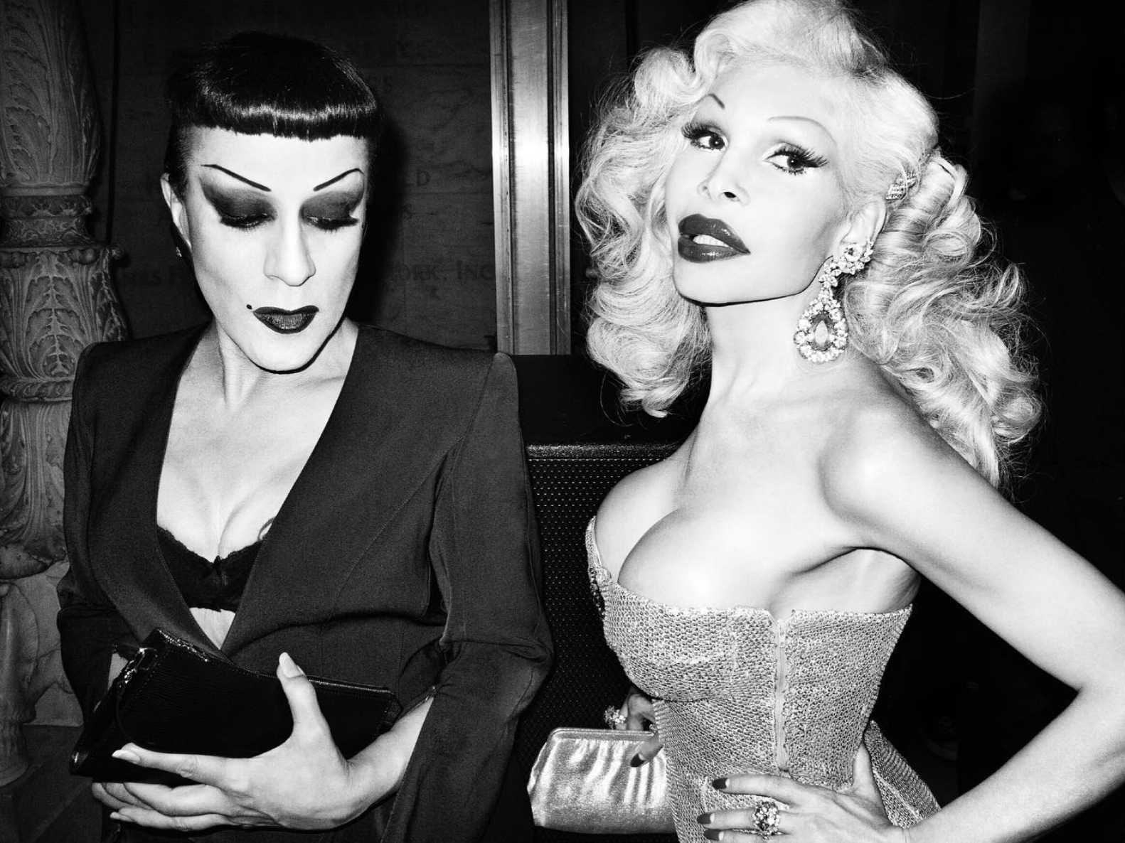
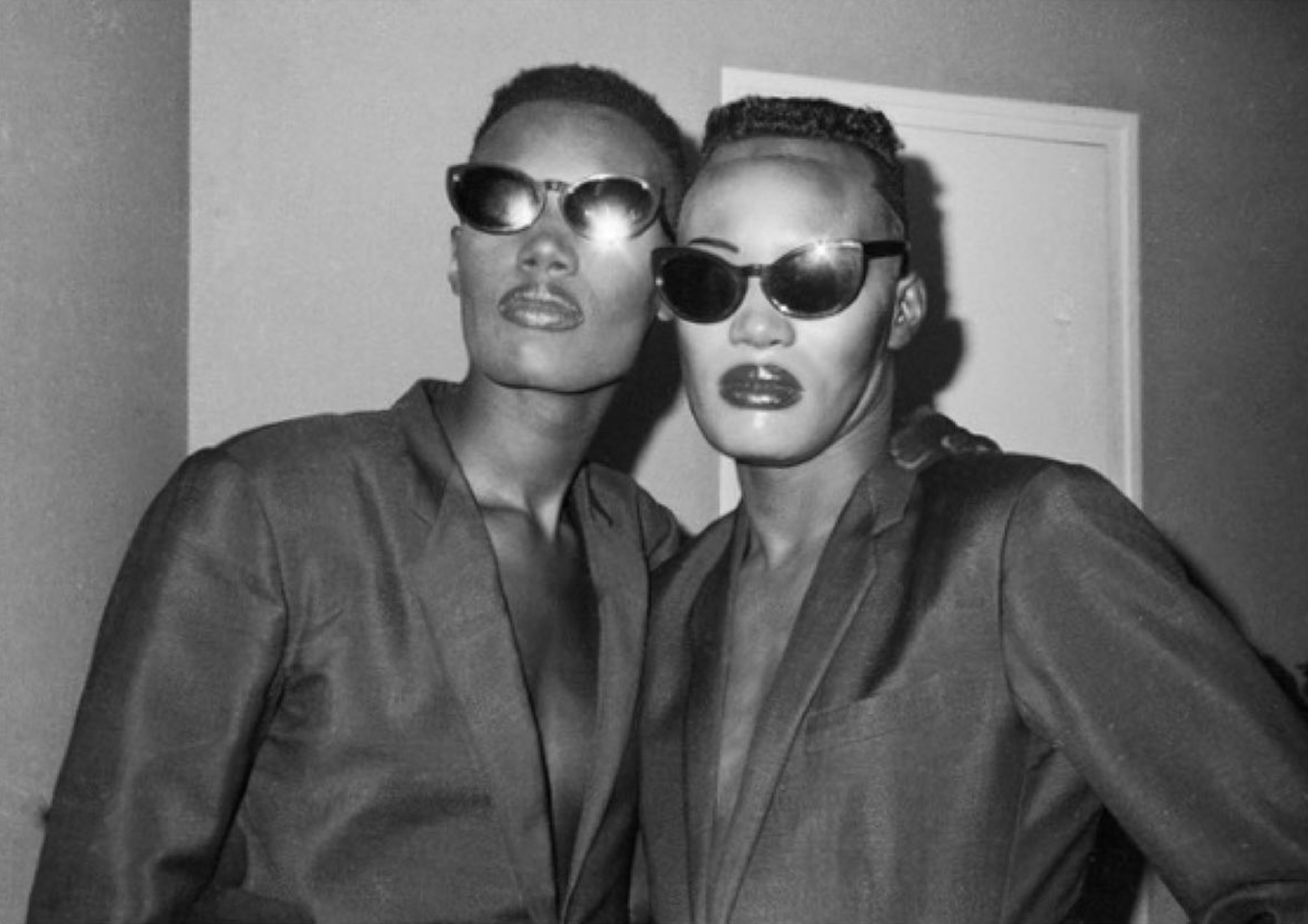
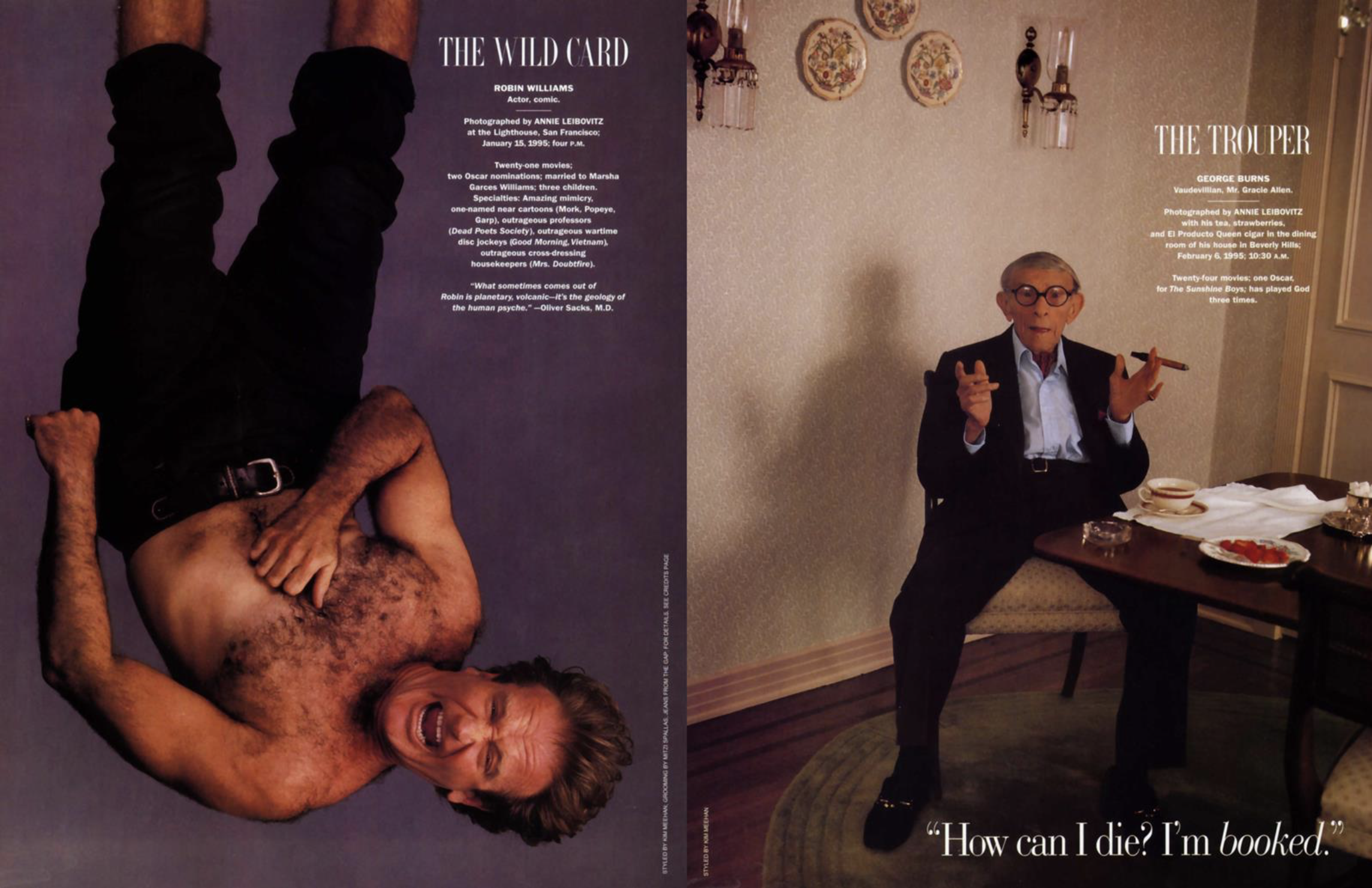
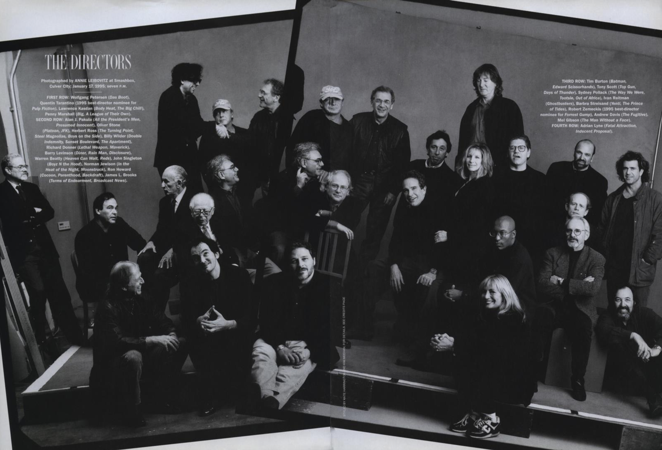
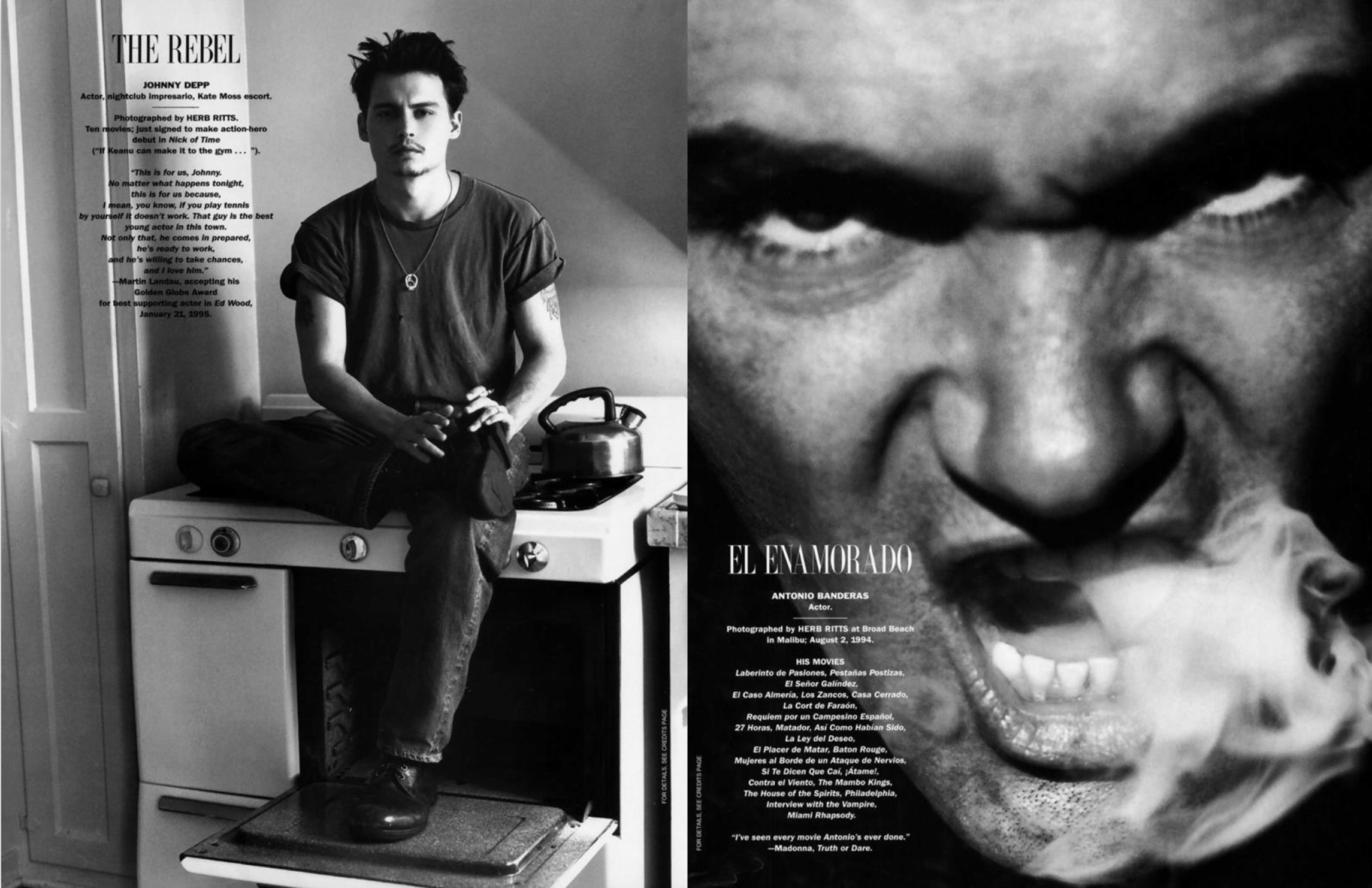
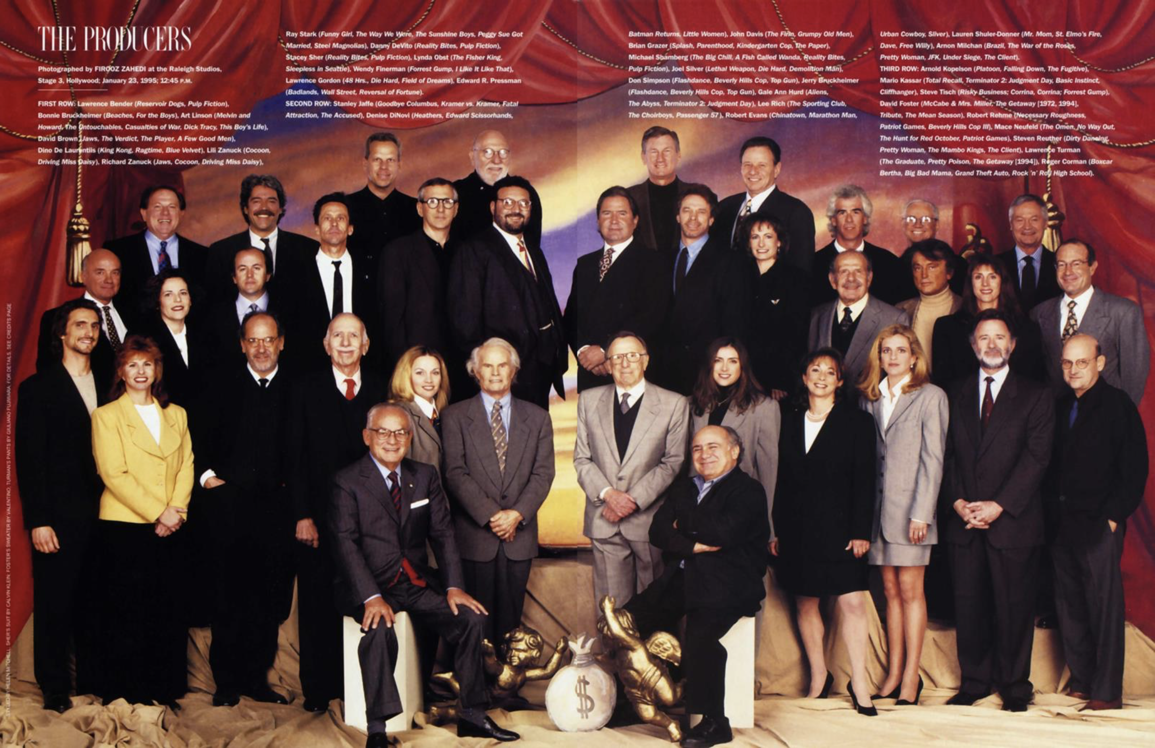
Annie had shot most of the portfolio along with Herb Ritts. I knew her from when I was. first on staff at Vanity Fair and my roommate at the time, Carol Lefluffy was her studio manager for years. So what I remember most was just me and Annie in the planning room cropping pictures (mey blowing them up on the copier) and then figuring out a pairings and then an order. with David and Graydon. Not all of Conde Nast was on computer yet, although I did work for Allure before and after that, the first magazine at CNP not done entirely by hand in paste-up form.
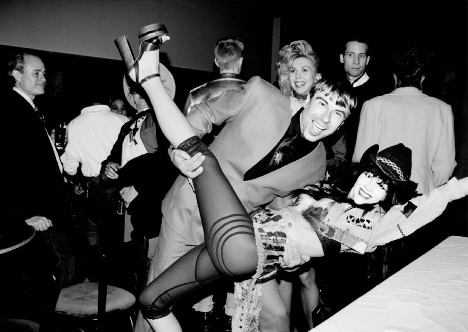
I worked on the Hollywood cover too, which was a montage of groups of people shot together and then to advertise the issue. Annie shot all of the women in lingerie and she may have planned this idea but I think it was coincidence as Lemon & Curtis were reprising their Some Like It Hot roles for a ’94 update, which Annie Also shot.
I remember one moment when Annie was in a sort of foul mood and kept handing me stuff to copy and then jerking copies out of my hand. At one point she tried to grab a page cropper out of my hand and I held onto it, and looked her in the eye and said, “I’m on YOUR side. I’m here to help…” And she kinda stammered, “Yeah, I know… yeah.” After that we got along even better. I’ve found with people that have notorious tempers and can be short or keep pushing you, that it helps to draw a personal line in the sand. Never had another cross word between us.
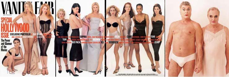
The Sunset Blvd billboard up in the Spring of ‘95 was the fold-out cover plus Lemmon & Curtis
Graydon mentioned the first Hollywood issue cover in his farewell editor’s letter…
“After an exhilarating life at Spy and a giddy, shoestring year at The New York Observer, being given the editorship of Vanity Fair was truly like being given the keys to an almost fictional magazine kingdom. Back in the day we didn’t even have budgets. S. I. Newhouse, Jr., our legendary proprietor, just said to spend what you needed. In the late 90s, we were having lunch and I told him that I had some good news and some bad news. He said, ‘What’s the bad news?‘ I told him that the Hollywood Issue cover we had just shot might well be the most expensive magazine cover ever. Si thought for a moment, then asked, ‘Well, what’s the good news?‘ I said it looked like the most expensive magazine cover ever. Only Si would have smiled at such news.”
Graydon’s 1994 intro to the first Hollywood Issue…
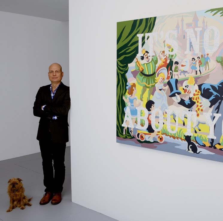
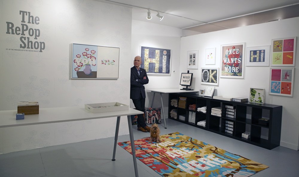
That was a LONG time ago, Si is gone (along with those unlimited budgets) and Graydon is now doing his newsletter publication, Airmail which, to me, is more like Vanity Fair than what Conde Nast puts out. I left magazines almost 20 years ago (after being the art director and creative director for Us Weekly & OK!) Now, I’m a full-time artist/writer, upstate in my converted gas station/ painting studio/ gallery. I also have a place in Merida Mx, where I lately I’ve been dipping my big toe back into publishing as Creative Director for Yucatan Magazine. Our Destinations issue is out in 2 weeks.
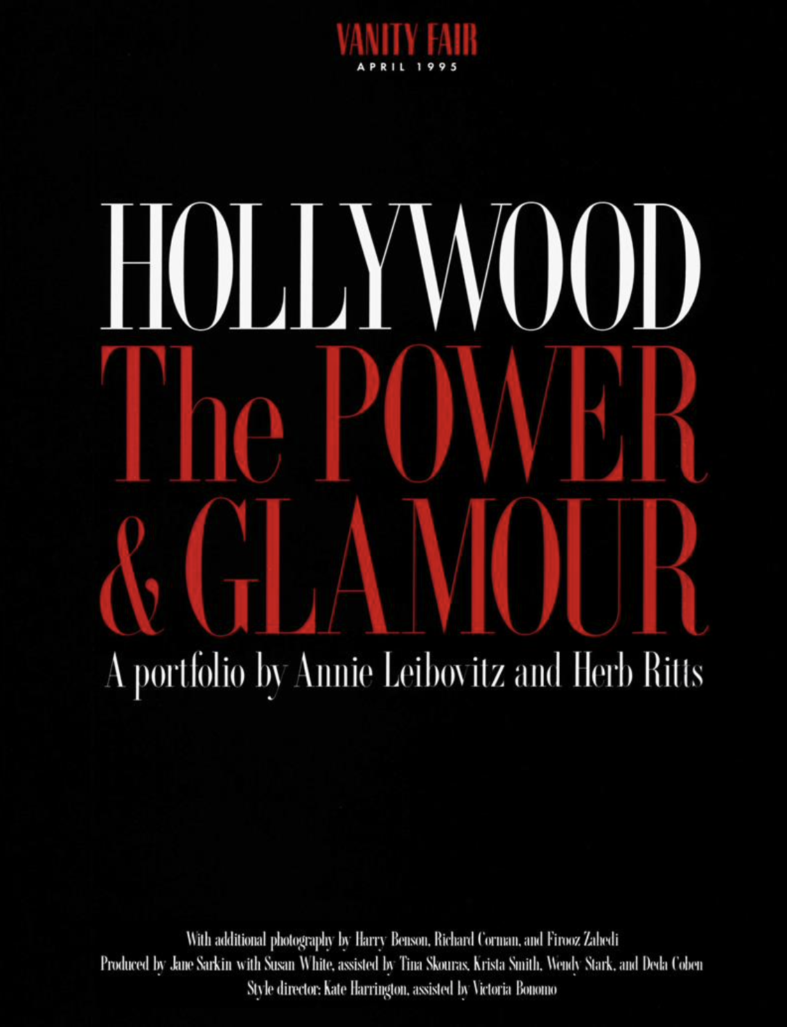
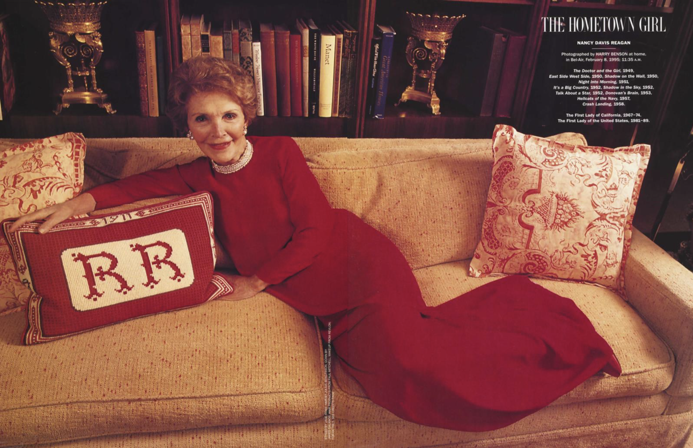
Below I’ve included the entire portfolio of the first Hollywood Issue which really is a who’s who of the industry at the time going back to the old studio days and ending with a bit of a bummer, former actress/First Lady Nancy Reagan. We should have stopped with Lemmon and Curtis. You can see the new 30th anniversary issue here and in VF’s archive you can see every page of the 1995 issue plus every page of every issue since the very begining EVER, here.
Some things never change. Right, Barre-ry?


Presenting the 30th annual #VFHollywood Issue, our cheekiest yet, starring Bradley Cooper, Natalie Portman, Pedro Pascal, Colman Domingo, Jodie Comer, Lily Gladstone, Greta Lee, Charles Melton, Da’Vine Joy Randolph, Jenna Ortega, and Barry Keoghan.
— VANITY FAIR (@VanityFair) February 21, 2024
🔗: https://t.co/q98NkynQzU… pic.twitter.com/S5ID11nPag