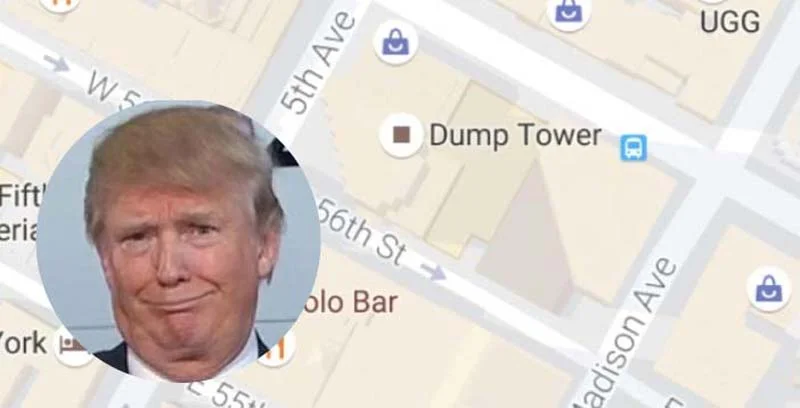
“For this series of paintings, the idea was to create pictures that would not be misinterpreted or misunderstood by me or anybody else. When the Halcyon Gallery brought the idea of me doing American landscapes for an exhibition, all they had to do was say it once. And after a bit of clarification, I took it to heart and ran with it. The common theme of these works having something to do with the American landscape—how you see it while crisscrossing the land and seeing it for what it’s worth. Staying out of the mainstream and traveling the back roads, free-born style. I believe that the key to the future is in the remnants of the past. That you have to master the idioms of your own time before you can have any identity in the present tense. Your past begins the day you were born and to disregard it is cheating yourself of who you really are.
My idea was to keep things simple, only deal with what is externally visible. These paintings are up to the moment realism—archaic, most static, but quivering in appearance. They contradict the modern world. However, that’s my doing. The San Francisco Chinatown street stands merely two blocks away from corporate, windowless buildings. But these cold giant structures have no meaning for me in the world that I see or choose to see or be a part of or gain entrance to. If you look half a block away from the Coney Island hot-dog stand, the sky is littered with high rises. I choose not to see them either. Down the road, across the highway from the Cabin in the Woods is a manicured golf course. But it has little meaning compared to the seemingly worthless shack which speaks to me. The Alabama Side Show is surrounded by woods in all directions. The side show happens to be in a clearing and you go there by dirt road. I chose to paint the side show instead of the endless woods. There are countless other works where this is also true.
All the iconography is used in a semi-conscious way. I chose images because of the meanings they have for me, and patterns can be seen in the repeating images—roads, shacks, piers, automobiles, streets, bayous, railroad tracks, bridges, motels, truck stops, power lines, farmyards, theater marquees, churches, signs and symbols, etc.—all establishing a certain type of compositional value. I would say the purpose is plain, non-experimental or exploratory.
Some of these works have much complexity of detail. Some are less demanding . . . in some cases my hand couldn’t do what my eye was perceiving. So I went to the camera-obscura method. The camera obscura was a primitive camera invented in the 1600s which projected an image upside down so the painter could work from it. This was a real camera, but the image was not printable. It could only be seen and filled in. Caravaggio used this in about all of his paintings and so did Van Eyck and Vermeer. These days you don’t have to go to all that trouble. You can use a real camera. I put a 58-mm 0.43x wide-angle conversion lens onto a used Nikon D3300 Af-p on quite a few paintings, Downtown Bank, Katz’s, Nathans, Russ & Daughters, Roy’s, Blue Line, among others, and was able to get the desired effect. If that didn’t work, I used a convex Plexiglass RCA 24 x 20 television screen that can be found in old junk shops and looked at the world through that. On Curry Road in Arizona, I used an old movie frame, and I did that on a couple of different paintings, too. In just as many others I drew it straight on. Topanga Ranch, Ice Cream Factory, Truck Stops, Flat Top Mt. Diner, and Del Rio Cantina. The method with the particular altered lens was used for fullness of effect. In a lot of the other cases, all I needed was a straight edge, compass, and a T square going on a case-by-case basis without abandoning tradition or adhering to any conventions or aesthetic doctrines.
The watercolors and acrylics done here purposely show little or no emotion, yet I would say they are not necessarily emotionally stringent. The attempt was made to represent reality and images as they are without idealizing them. My idea is to compose works that create stability, working with generalized, universal, and easily identifiable objects. Throughout, there is the attempt to depict scenes of life and inanimate life for their own sake (Ice Cream Shack, Arcade, Threatening Skies). Da Vinci paints a blurred picture—you see no lines but clouds that fade into one another with different color schemes. An opposing view would be Mondrian and Van Gogh with strict lines that define the volumes of space. In the middle somewhere would be Kandinsky and Rouault. And these paintings would probably fall into that category.
An attempt was made to depersonalize the works—strip them of illusion. All the work is exclusively placed in non-exotic settings within a rationally defined space. The focus points are important and sometimes unusually placed. Background and foreground not easily defined. In Amusement Park Alleyway, the focus point is the Ferris wheel in the background. The orange Chevy truck might be centered in the foreground but it’s not the focal point. In Morning in Pittsburgh, the focal point would be the bridge in the background instead of the larger warehouse in the foreground. Just like in the Flat Top Diner, the focal point might actually be the green trees.
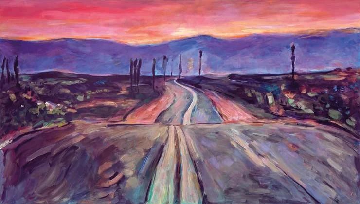
I tried to create the two dimensional image using a mathematical system. At times, the background and foreground converge. Natural scenery is always the main feature. These are not crowded compositions. They are using basic structures to express feelings and ideas. Perfect proportion and logic instead of emotion. The nature of beauty, the lines, forms, shape, and texture that emphasize the recognizable create harmony where natural scenery is the main feature.
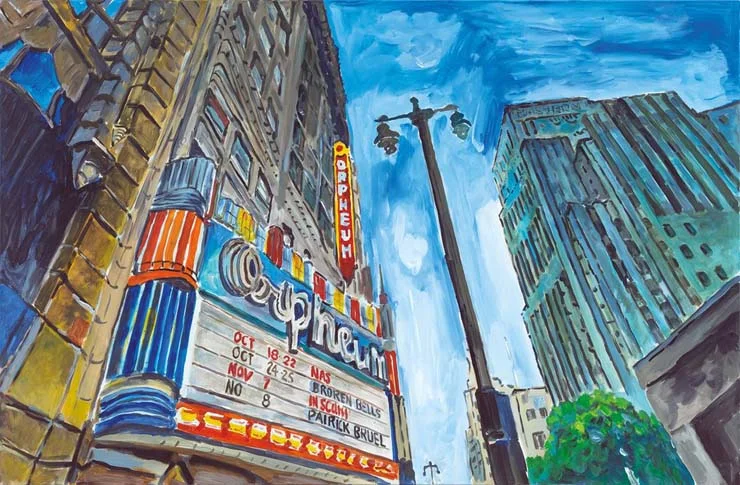
I restricted myself to traditional subject matter, viewing nothing as shallow or gaudy. A simple hot-dog stand can have classical features, and I view it as such (Donut Shop, High Wire). Whiplash curves, flying buttresses, pointed steeples, arches, and waves. They are all there, reflecting any time period, purposely trying to stay away from dramatic or theatrical lighting effects, bringing naturalism to the forefront.
In some paintings, the brightness of reflected light was brought forth in evident brushstrokes. Sometimes sunlight hitting certain places would contrast deeply with areas of shadow (Sunset on the Prairie, Threatening Skies). I tried to avoid skewed perspectives or man-made light, yet sometimes it couldn’t be avoided. An expert painter is a master in color theory, which means he can turn white into black using a complex value system of colors and hues like a Mark Rothko. “The Beaten Path” however, reflects explorations in color, sometimes using colors that become less pronounced and outlines that become less precise. Other times tipping toward the monochromatic (Oil Rigger’s Shack, Twilight After Dusk).
Flowing or curved lines form another visual vehicle, suggesting a far distance in a landscape painting. Architecture itself is always a vital source of ideas and inspiration, but, always, “The Beaten Path” tries to return to the traditional methods of perceptions—things that are perceived in the visible world—taking the three dimensional into a two dimensional format using contrast, location, isolation, and convergence.
If there is a soundtrack to this compilation of paintings, I would say it could be recordings by Peetie Wheatstraw in some places, Charlie Parker in others, Clifford Brown or Blind Lemon, maybe Guitar Slim—artists that make us a lot bigger when listening to them. It would have to be that way. Absolutely.
There was a conscious attempt to dismiss consumer culture or popular culture, including mass media, commercial art, celebrities, consumer or product packaging, billboard signs, comic strips, magazine advertising. “The Beaten Path” works represent a different subject matter from the everyday imagery of consumer culture. There is nothing to suggest these paintings were inspired by the writings of Sigmund Freud or that they were based on any mental images that occur in dreams, no fantasy worlds, religious mysticism or ambiguous subject matter. In every picture the viewer doesn’t have to wonder whether it’s an actual object or a delusional one. If the viewer visited where the picture actually existed, he or she would see the same thing. It is what unites us all.” –Bob Dylan