THE PANTONE HOTEL IS (INSERT COLORFUL PUN)
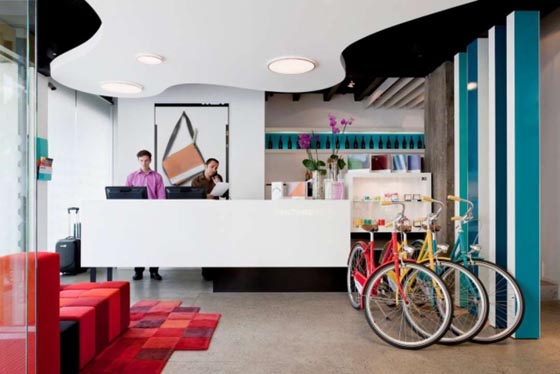
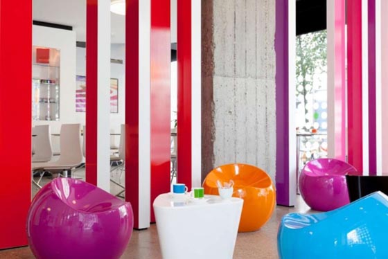
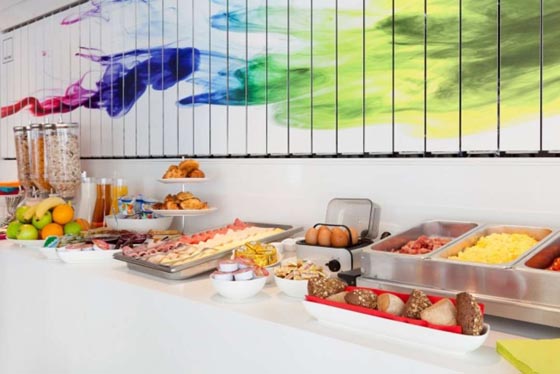
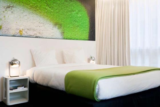
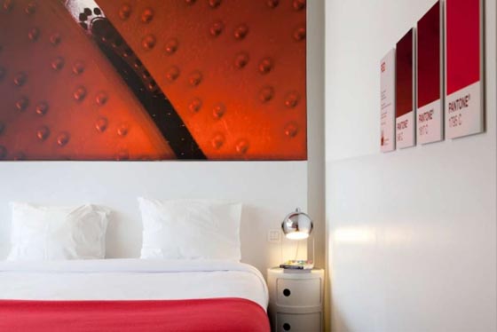
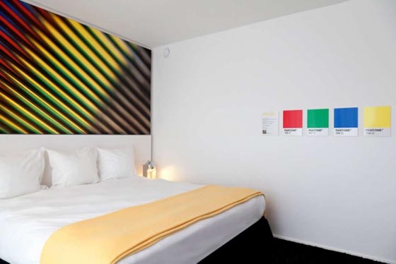
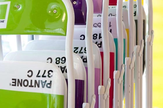
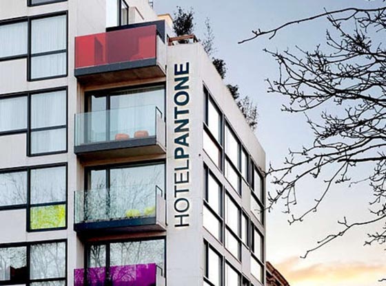
As a former graphic designer, the Pantone Color Matching System –or as we always called it, PMS– was part of my daily life for years. But it was always an insider-y sort of industry thing. But in the last 10-15 years, Pantone has taken branding to new levels to produce paint, products and now a hotel experience in Brussels. The Pantone Hotel, designed by architect Olivier Hannaert and outfitted by interior designer Michel Penneman, has 57 rooms that uses seven different colors, one for each floor. Of course, to make color pop, you need a lot of white. Personally, I think they wimped out a little. I could see each room done in 20 different reds or greens, but nevertheless, this is a designers wet, PMS dream. Color me ________. (Click image to see gallery)

