THE METROPOLITAN MUSEUM'S NEW LOGO & THE MET BREUER DISAPPOINT
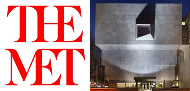
These days everyone is a designer and critic too, for that matter. We are all entitled to our opinion but the reaction to The Metropolitan Museum‘s new logo has been CRAZY-negative. New York magazine’s headline for a story on the controversy was,
The Metropolitan Museum of Art’s New Logo Is a Typographic Bus Crash
Among the MANY other critics in and out of the design world, illustrator and designer Steve Cup summed it up on Twitter,
“The Metropolitan Museum of Art’s new logo is basically the Human Centipede of branding.“
It’s hard to come up with worse than that. By way of explanation, The Met said in a statement;
“The new logo no longer relies on symbols and, instead, is based on the commonly used name ‘The Met, which has an immediacy that speaks to all audiences. It is an original drawing, a hybrid that combines and connects serif and sans serif, classical and modern letterforms. In this respect, it reflects the scope of the Museum’s collection and the connections that exist within it. There may be debate about the logo because it involves change, but the museum chose it because it represents something simple, bold, and indisputable: The Met is here for everyone.“
London’s Wolff Olins designed the new logo. In the 90s it helped a disparate constellation of British museums — Tate Britain, Tate Modern, Tate Liverpool, and Tate St. Ives — develop a unifying identity, with the name in blurred letters as if spray-painted with a nearly empty can. This process was observed closely, by the head of its modern and contemporary art, Sheena Wagstaff, who spent more than a decade as chief curator at Tate Modern. But Wolff Olins’s strategy director Amy Lee told The Wall Street Journal that the company was not afraid of creating,
“work that people feel strongly about” and that “the project is about far more than just a logo—it is about expanding the reach and relevance of the Met.”
So much else has been said but I’ll add my 2 cents. I’ve designed many logos myself and I once taught logo design at The New School, even though I was self-taught. I like this design personally. These days you need an insignia that goes across all media, online, in print and in person and this accomplishes all those goals and even if you disagree, EVERYONE is talking about it. Instant success in today’s world. If it had been your run-of-the-mill rebranding it would have gone virtually unnoticed.
The Met is in a physically expansive period, as well. Art critic Roberta Smith said in The New York Times,
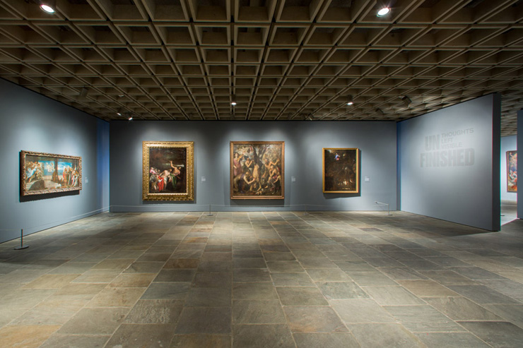
“After a year and a half of anticipation, the revered Metropolitan Museum of Art has finally taken over the Whitney Museum of American Art’s Marcel Breuer building on Madison Avenue, promising to broaden and deepen its involvement with modern and contemporary art. Rebranded as the Met Breuer — with the subtlest sprucing up by architects Beyer Blinder Belle — this move is the first step of a plan that will include a $600 million new wing in the Met’s Fifth Avenue building as well.
For those who wondered if the Met would challenge the Museum of Modern Art or the downtown Whitney, the two opening shows at the Met Breuer feel more like a toe in the water of contemporary art than the expected plunge.“
Not a pan but not a resounding, “Yes!” either. She went on to say,
“The question of exactly what the Met is doing in the Breuer building is not yet clearly answered. The museum is on solid ground with its Mohamedi survey and also when bringing older art to life, sometimes with less old art, as in the early parts of “Unfinished.” But around contemporary art, its learning curve seems steeper than expected.”
The Met only has an eight year lease on the space as The Whitney accepted a large donation for their new downtown location with the stipulation that they NEVER sell the Breuer building. So, they may take it back at some point or continue to lease it to the best museum in the world. Either way, it’s a win-win for New Yorkers, especially artists like me.


